*GONE BACK AND ADDED MORE DETAIL 03/04/2015*
This is a table of what conventions were on my college magazine and which were on my music magazine. It is clear to see the development from the first task to now, as I hardly had any of the conventions of a genuine magazine on the college one. I didn't really have a colour scheme, and I didn't have any feature stories or a realistic looking plug, etc.
--------------------------------------------------------------------------------------------------------------------------
BELOW IS THE NEW EVALUATION OF QUESTION 7, THE ABOVE WILL BE DELETED ONCE THE BELOW ONE HAS BEEN CHECKED FOR IMPROVEMENTS.
The first thing I ever did was create a LIIAR analysis of an existing Kerrang magazine front cover, in order to begin to understand conventions of real media products:
I was able to pick out the main image of the cover and say that the high up angle was useful, because you usually expect to see medium close up of artists or bands on covers, but having an usual angle draws attention. In addition to this, I began to pick out key bits of terminology such as feature stories, mast head and plugs, to show the conventions of real magazines, that I'd have to use in mine in order for my product to look realistic.
For my preliminary task I was asked to create a front cover of a college magazine, which was in preparation for my final product. I started by creating a small mood board on what kind of images I'd expect to see on the front cover of a college magazine, which can be seen below:
I took these images from the Wyke College flikr account, and began to understand what kinds of shots are common to use - medium close ups. The majority of these images show students holding up folders, or items related to the course they are studying, which I took into consideration when creating the preliminary task magazine cover.
Then I decided on the font I'd use on the front of the college magazine, and went with 'PERPETUA TITLING MT', and used it for both the title and the subtitle on the cover.
I then created a digital mock up of my front cover, which can be seen below:
This was useful to create, because it got me to think about the key features of a front cover, which can be seen - the title of the magazine, the name of the issue, the date and price of the issue, a plug and a barcode. Obviously later on I understood that a cover had to be filled more than this, but as this was the first thing I had ever made on Photoshop, at that point in time I thought it was average.
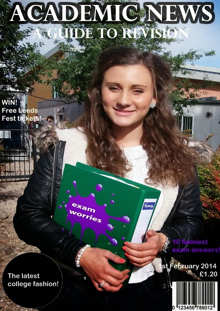
After creating my digital mock up, I took pictures using a borrowed college camera, of the people I was going to put on the front cover of my magazine. And then after taking my potential pictures and uploading them onto my blog, I created my college magazine front cover.

I thought that in comparison to the mockup, I had created a semi-professional looking product (at that point in time). I thought that I had taken into consideration the images I found on the Wyke flikr account, and had taken an image similar, with my model holding up a folder to show she has notes on her academic studies. I had never used Photoshop before and so creating this on it felt like a big deal, and I felt like anything I did was successful, as I was so amateur at it. I created a 'splat' type object on top of the folder my model was holding, with the words 'exam worries' on it. I thought this would be relevant, as the first thing I and many others I know think of when they think of A Levels, are exams. I thought of this when creating the plug to the right of the folder '10 funniest exam answers' as it lightens up the mood of the exam worries, as the reader can have a joke at where others went wrong in their exams. I also followed other conventions, such as the plug on the left in the circle 'the latest college fashion!' and the chance to win tickets to Leeds Festival. I thought at the time that the barcode, date of issue and price looked realistic in relation to the placement.
This was then my full product:
Looking back at the preliminary college magazine task and my full product music magazine task, it is clear I have learnt a lot in terms of developing skills. The college magazine task was the first time that I had properly used Photoshop, and I could not get the hang of how to do things such as changing the brightness and contrast, or even how to make the text look bold by outlining it.
This can be seen through the title and subtitle of my college magazine:
Looking back on this now I can see where I could have improved, especially on the subtitle 'A GUIDE TO REVISION'. At the time I was thinking I should only outline the title 'ACADEMIC NEWS' as it had to stand out more than the rest of the text, however, I understand now that unless the subtitle is zoomed in like this, it really is not that easy to read or understand.
This can also be seen through the plug on the left of my college magazine:
I can clearly see on this one that I could have easily improved. I could have improved by making the 'WIN!' bolder and in a larger font than the rest of the text with it, because even thought it is in capitals where the other text is not, it still does not stand out as much as it should do. In addition to this, the 'tickets' is not clearly visible to see, as there is someone stood right behind it, and like the above, it can only be really read clearly when zoomed in like this.
A final way in which I could have improved on the text on my preliminary task, is this:
One thing that clearly stands out on this zoomed in image, is the fact that you cannot clearly see the date of issue. 'February 2014' is fine, but the '1st' is very unclear, unless zoomed in like this. This is because the model's coat or tshirt was in the background, and so white on white clearly does not work.
I understand all of these problems with the preliminary task now after undergoing the full task and seeing how crucial it is to make sure that the text is really visible for the reader, which is one of the many things that I have learnt in the progression from it to the full product, as in my full product it is clear to see that I have used a black outline on all of the white text, for example:
I have made sure that I did not make the same mistake again on the full product, I made sure I outlined the white text with a bold black stroke, so it all of the white text is visible all over the magazine.
I also created a small table as a tick list to see if I had used the key features of a magazine on both the preliminary task and the full product:
This table shows that all of the key conventions I had picked out that I thought were very important. Even from looking at that quick check list it is clear to see I had missed out on common connotations of magazine front covers, for example I missed out on a clear main story, which is what will obviously attract the consumer in to buying the product.
I am glad that I looked back on the college magazine front cover before creating my proper music magazine front cover, as it meant that I knew where I went wrong and what I could do to make sure that I either did not use the same technique as I used on the college magazine, or I did use that technique but developed it to make sure my full product looked professional and not as a part of my coursework. By looking back on the college magazine and created this check list, meant that I knew that I needed to add a main story on the front of my music magazine and also a plug, and to stick to a colour scheme which was particularly important on the music magazine, as I had to create a contents page and a double page spread too, and by making sure I stuck to a specific colour scheme, it showed continuity between the three products, and made them seem part of the same magazine.


.jpg)


