This print screen was in the middle of changing the 'Levels' of the cover image of my model. I wanted to make the background brighter at the top, so the model's face stood out a lot more. I think this image looks very good because the brightness fades gradually.
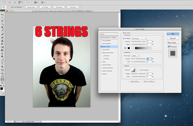
In this print screen, you can see that I'm editing the masthead of my magazine cover, making the writing stand out more by adding an outer glow (in black).
In this print screen you can see that I have selected the print on the model's shirt to focus on, and adding another layer on Photoshop to work on this certain area. At this point in time, I was working on the 'Levels' again, as I didn't want the Guns N Roses logo on the front of the shirt to stand out, as that isn't relevant to my magazine cover, and therefore I wanted it to be dark and as not eye catching as it was due to it being on a black shirt.


No comments:
Post a Comment