This is my final front cover for my music magazine. The inspiration for this was NME magazine, especially the colour scheme and the plug at the bottom.
Thursday, 19 December 2013
Thursday, 12 December 2013
Magazine Front Cover Screenshots
This print screen was in the middle of changing the 'Levels' of the cover image of my model. I wanted to make the background brighter at the top, so the model's face stood out a lot more. I think this image looks very good because the brightness fades gradually.
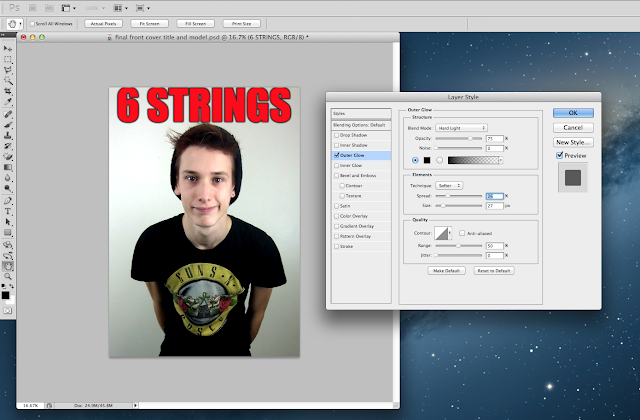
In this print screen, you can see that I'm editing the masthead of my magazine cover, making the writing stand out more by adding an outer glow (in black).
In this print screen you can see that I have selected the print on the model's shirt to focus on, and adding another layer on Photoshop to work on this certain area. At this point in time, I was working on the 'Levels' again, as I didn't want the Guns N Roses logo on the front of the shirt to stand out, as that isn't relevant to my magazine cover, and therefore I wanted it to be dark and as not eye catching as it was due to it being on a black shirt.
Saturday, 7 December 2013
Photos For My Front Cover, Contents Page and Double Page Spread
I didn't want to use this image because the model for my front cover had ear phones in and it didn't look very professional.
This image for one, was too dark, and I felt like the facial expression wasn't right for the front cover of my music magazine.
I liked this image because it seems fun, however it again didn't seem right for a music magazine.
This image was a non serious one, simply because the 'Stagg' on the drum was the same last name as the model for my front cover. After a second look at the image I knew because of the view of the carpet, and how it didn't look professional, it wasn't going to be on my front cover.
I wanted this person on my contents page because I think he suited the genre, especially with the green coat on.
Originally, I wanted a close up image for the contents page, and if it wasn't for the facial expression I may have used this.
I liked this image for my contents page, however, when I tried to crop it all different ways, it didn't really work because it was too zoomed in, or stretched out, therefore I chose a different image.
Friday, 6 December 2013
Photographs From Gigs

These photographs are ones I took myself from music events this year. I saw Paramore in Nottingham, Arctic Monkeys and The Strypes at Earl's Court in London, and Miles Kane at Hull University. Posting these on was very beneficial for me, because later on when creating my contents page, I already had a few images to chose from which could go on there.
Planning For My Magazine Front Cover
The weather seems good on Tuesday (10th December), because it's sunny and clear, and therefore it'll be good weather to take pictures of my model for the front cover, and double page spread
Thursday, 28 November 2013
Detailed Draft
I looked at a range of different colour schemes for my music magazine, and so I wanted my masthead to be bright and bold. In the end, I liked the red on the 6 strings and so I went with the third idea on this, but made the full masthead red.
This is in the process of my draft mock up.
This is in the process of my draft mock up.
This is my draft front cover. Obviously there will be a lot more text on the real one, but I like the use of the purple text, because it matches the model's t-shirt. In addition to this, the masthead '6 STRINGS' really stands out because the colour isn't seen anywhere else on cover.
Production Plan
Detailed Draft Front Page
28th November
29th November
Shoot Photographic Images (at least 20 examples: front page, contents page & double page spread)
5th December
6th December
Photoshop Manipulation Of Images
12th December
13th December
Finalise Front Cover Design
19th December
Complete Front Cover To Deadline
20th December
Thursday, 14 November 2013
Photographic Influence
These are some of my photographic influences. This is because the front covers are all very busy, and do not seem to have any room to write more anywhere! I think this is a good thing about NME magazine, because you know in each issue that there is always going to be something worth reading!
These album covers were photographic influence to me because the majority of them are basic images made to look interesting, and appealing. For example, the Two Door Cinema Club album is a basic image of two people stood on a bridge, however, because it has been manipulated by the effect on the picture and the large bold writing above it, it makes it eye catching for anyone. That made it influential to me because I had already chose to make the image on the front of my cover plain like this, and then manipulate the image to draw attention to it. In my opinion, I think I made that work on my front cover quite well.
Cast
This is the kind of person who would be ideal for the front cover of my music magazine because of the clothing he is wearing. This in itself is one of the many styles that the indie genre is associated with. This is because many of the artists within this genre wear a lot of clothing like this of the model on here.
Props And Locations
These are my photographic influences of where I could set the main image of my model on my music magazine front cover. I wanted it to be behind a clear background, so the focus was on my model instead of the location it was set. Furthermore, I wanted it to be focused on the way the main artist was stood, and the clothing he was wearing as that would tell any potential consumer who the target audience was.
These are a variety of the types of clothing items and things associated with the consumer of my genre of music magazine. The audience would probably wear band t shirts relating to my genre, for example, Ramones. In addition to this, Dr Martens are generally seen on a lot of festival go-ers, and a lot of festivals are targeted at the indie genre.
Name Ideas For My Music Magazine
These are some of the ideas I have for the title of my music magazine. I chose two, "6 strings" and "chord" because they are things to do with music, and therefore they both seem like genuine titles. However, I also thought of some other words I could use for a title, and even thought of two acronyms; "NIM" and "PIM" which stand for "New Indie Magazine" and "Popular Indie Magazine". These also would be good magazine titles, because even NME is an acronym.
Focus Group Questions
I chose these questions because there are individual, and the answer would be different for everyone I asked.
Thursday, 7 November 2013
My Audience Media Pack
This is my audience media pack, and in my opinion it turned out really well. After researching other media packs, which can be seen on my blog (NME and Q), I understood what it was that I had to write on my own. In addition to this, on most media packs (but not all), they dedicate a paragraph to an individual who reads their magazine which gives you brief detail about them. When it came to creating mine, I thought of using a 26 year old male, because after again researching, I found that the majority of the readers of indie magazines like NME are male and over the age of 20. I enjoyed creating my media pack, and think it looks very genuine.
Thursday, 17 October 2013
My Genre Of Magazine
The genre of magazine is influenced by famous ones like 'NME' and 'Q', because I think that the layout of those magazines always look really professional and stand out from the rest. Both of those magazines are types that I'd buy from a shop, purely because the front cover had reeled me in!
The Music Magazine Brief
To design a front cover, contents, and double page spread of a new magazine. All images and text used must be original, a minimum of four images must be used.
Thursday, 3 October 2013
Photographs and Images
These photographs were taken by me and were potential images for my front cover, however, I found the one that I chose to be better than these ones.
Magazine Name and Type Style
This is the title I have used for my college magazine front cover. The font I used is 'PERPETUA TITLING MT', and I used this for both the title and the subtitle.
Mood Boards and Influences
These are my influences for my college magazine front cover, because they're medium close ups, and the majority of them are holding folders and I think that it'd make the front cover look more professional.
Subscribe to:
Comments (Atom)


